Skip to content
How Packaging Color Psychology Influences Buying Decisions in Seconds
Before a customer reads your product name, before they see your logo, before they process any information on your packaging at all — they have already reacted to the color. Color is processed by the brain faster than any other visual element. It triggers emotional associations, category signals, and quality judgments in milliseconds. And in a retail environment or an e-commerce search results page where the customer is scanning rather than reading, color is often the only packaging element that gets processed at all before the purchase decision is made.
Color influences how consumers perceive your brand, often within seconds, and it carries more weight than many realize. Research from packaging strategists consistently shows that up to 85% of purchase decisions involve color as a primary factor. For brands making packaging decisions, understanding the psychology behind color — what different colors communicate, how color combinations work, and how color signals interact with category expectations — is one of the most practical brand investments available.
This article breaks down the packaging color psychology that drives buying decisions in 2026, with specific applications for the product categories we work with at Packaging Island.
Why Color Works the Way It Does in Packaging
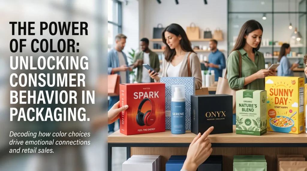
Color psychology in packaging operates through two parallel mechanisms. The first is universal or near-universal association — colors that carry consistent emotional meaning across cultures and demographics. Blue communicates trust and reliability with remarkable consistency across consumer research conducted in different countries and cultures. Red communicates urgency, excitement, and appetite. Green communicates nature, health, and permission. These associations are deep enough to be treated as near-universal starting points in packaging design.
The second mechanism is category-specific signaling. In any product category, colors that dominate the shelf create associations with the category itself. Premium skincare shelves in the USA are dominated by white, cream, and muted tones — so those colors communicate premium skincare positioning even without other brand signals. Mass-market cleaning products are dominated by bright primary colors — so those colors communicate functional, budget-oriented products in that context. Understanding what colors your category has trained customers to associate with specific positioning is essential for making color choices that communicate correctly.
Color Psychology by Category
Beauty and Cosmetics
White and cream communicate clean formulas, clinical efficacy, and premium positioning in the skincare and cosmetics category. It is the color choice of brands that want their product to speak without decoration. Black communicates luxury and sophistication — used by high-end cosmetic brands and premium fragrance labels to signal exclusivity. Gold and rose gold communicate femininity and premium quality simultaneously, which is why they appear consistently across mid-to-premium cosmetic packaging.
Natural greens and earthy tones communicate organic, clean beauty positioning — the visual language of brands built around natural ingredients and sustainable sourcing. For natural and organic beauty brands, this color palette creates immediate category recognition with the conscious consumer audience.
Food and Beverage
Red and orange are appetite stimulants — confirmed by decades of food psychology research and demonstrated by the consistent use of these colors in food service branding globally. For food brands wanting to communicate indulgence, appetite appeal, and flavor intensity, warm reds and oranges are the most reliable color choices.
Green communicates health, freshness, and natural ingredients in food packaging — the dominant color across health food brands, organic food lines, and wellness-positioned food products. Consumers have been conditioned to associate green food packaging with better-for-you products, making it a powerful positioning signal in the health food category.
Brown and kraft communicate artisan, handmade, and natural in food packaging — signaling the opposite of industrial production and communicating the kind of quality story that specialty food customers are willing to pay a premium for.
CBD and Wellness
The wellness category in 2026 has developed a sophisticated color language. Deep greens communicate hemp-derived, plant-based, and natural positioning. Muted earth tones — warm terracottas, dusty blues, soft ochres — communicate calm and balance without the clinical coldness of pure white. Black and gold combinations communicate luxury wellness — the premium tier of CBD and supplement brands positioning their products as sophisticated lifestyle choices rather than basic health supplements.
Men’s Grooming
Dark colors — charcoal, navy, deep green, matte black — consistently communicate masculine positioning in grooming packaging. Combined with single-color or minimal print, these backgrounds project seriousness and quality without ornamentation. The grooming market has moved firmly away from bright primary colors in the premium segment, and brands that haven’t made this shift are increasingly looking dated against competitors that have.
The 2026 Direction in Packaging Color
Packaging in 2026 is all about balance. On one side, we see clarity, simplicity and designs that strip back the noise. On the other hand, there’s personality, imperfection and storytelling that feels human.
The dominant color direction in premium packaging in 2026 is toward restraint and intentionality rather than maximalism. Muted, sophisticated color palettes are outperforming bright, saturated alternatives in most premium product categories. Not because color is less important — it is more important than ever — but because the brands using color most effectively in 2026 are using it with more precision and restraint than brands a generation ago.
Monochromatic packaging — where the entire box uses variations of a single color family — is growing in premium beauty, wellness, and lifestyle packaging because it creates a strong, memorable visual identity that works consistently across product ranges without requiring elaborate design. A brand with a strong single-color identity is more memorable and more recognizable across multiple SKUs than one using different color schemes for each product.
Textural contrast — using the same color in different finishes, such as gloss and matte, or foil and uncoated — is creating visual interest within constrained color palettes. This approach is increasingly common in premium cosmetic and wellness packaging and produces a sophisticated result that heavily multi-colored designs in the same price tier struggle to match.
Practical Color Advice for Brand Owners
Before making packaging color decisions, answer three questions honestly. First — what does my category’s color landscape look like, and am I choosing to align with it or differentiate from it deliberately? Both are valid strategies, but they need to be conscious choices. Second — what emotional state do I want my customer to be in when they pick up my product, and which colors reliably create that state? Third — does my color choice communicate the right price point for my product, and does it align with the other brand signals I’m sending?
At Packaging Island our pre-press design team works with brands specifically on packaging color strategy as part of the free design support included with every order. Color matching using PMS Pantone standards ensures that the colors on your approved design reproduce accurately and consistently in production.
FAQs
How important is color consistency across a product range?
Very important. Consistent color use across a product range builds brand recognition faster than individual product-specific color schemes. Customers who recognize your brand’s color from a distance are more likely to engage with it on a shelf without needing to read the name.
Can you match specific brand colors in packaging production?
Yes. We use PMS Pantone color matching to ensure accurate color reproduction across production batches. Pantone matching is the industry standard for brand color consistency in packaging.
Should packaging color match the product?
Not necessarily. Packaging color should communicate the right positioning and emotional state for the product category. Matching product color to packaging color can be effective when the product’s color is a selling point, but it is not a requirement.