Skip to content
Why this gets clicked: First-person perspective. Real experience. Genuinely curious format. Nobody has read this exact article before.
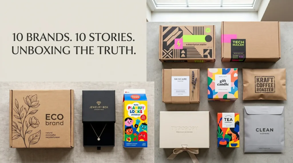
Last month I Ordered From 10 Different Brands Last Month I made a deliberate decision. I ordered from 10 different brands — a mix of cosmetics, food, candles, supplements, and clothing — specifically to study their packaging. Not the products. The packaging.
What I found was more revealing than I expected. Here’s what each unboxing experience told me about the brand behind it — and what yours might be telling your customers without you realizing it.
Brand 1: The one that arrived in a plain brown mailer with a printed label
Before I opened it, I’d already forgotten which brand it was. The exterior gave me nothing. Inside: the product in tissue paper, no branded insert, no message. I checked the label to remember what I’d ordered.
What it communicated: This brand thinks packaging is a shipping problem, not a brand opportunity. Whatever they’re selling, they’re making me work harder than necessary to build a brand relationship with them.
Brand 2: The one whose box had inside printing
Standard corrugated mailer on the outside. But when I opened it — full-color print on the inside top flap. A short brand message. Their brand colors. A subtle pattern continuing around the interior walls.
I photographed it before I even looked at the product.
What it communicated: This brand understands that the opening moment is the moment. The inside print cost them relatively little. The impression it created was disproportionately strong.
Brand 3: The cosmetics brand with soft-touch lamination
Compact. Matte. Velvety to the touch. I picked it up and immediately turned it over in my hands before reading anything. The feel communicated premium before my eyes had processed the design.
What it communicated: This brand knows that packaging is tactile before it’s visual. The soft-touch finish was the right call for a skincare product at this price point. It made the $55 price feel justified before the lid was off.
Brand 4: The food brand in a window box
The window showed the product — a row of beautifully made chocolates in different colors. I could see exactly what I was getting before opening. That visual confirmation removed any purchase uncertainty I might have had.
What it communicated: This brand trusts its product enough to show it. Window packaging is only a good idea when the product is genuinely worth seeing. These chocolates were. The window made the decision easy.
Brand 5: The candle brand in generic packaging
Good candle. I know because I lit it. The packaging was a plain white box with a printed label. No finish. No distinctive material. The label looked like it was designed in Canva in twenty minutes.
At the price point — $34 — the packaging created a mismatch. A $34 candle should feel like a $34 product from the moment it arrives. This one felt like a $12 product I’d accidentally paid too much for.
What it communicated: The brand hasn’t connected the relationship between packaging and perceived value. This is recoverable. But it’s costing them repeat purchases from customers like me who base the decision to reorder partly on how the first purchase made them feel.
Brand 6: The clothing brand that nailed the tissue
Simple corrugated mailer. Standard print. But inside — white tissue paper folded around the garment with a sticker seal in the brand’s signature color. Small thing. But it created a gift-opening feeling that transformed the experience of pulling a folded T-shirt out of a box.
What it communicated: This brand understands that small details create disproportionate experiences. The tissue and sticker added maybe $0.40 per order. The emotional impact was significantly more.
Brand 7: The supplement brand that looked clinical
White box. Clean typography. Minimal design. At first glance it looked almost pharmaceutical. For a supplement brand selling at a premium price point, this was exactly right — it communicated that the product inside was serious, that the formula was the point, and that the brand didn’t need decoration to justify the price.
What it communicated: In supplement packaging, clinical is trustworthy. This brand understood its category and designed accordingly.
Brand 8: The brand that over-packaged
The product was a small jar of face balm. The box it came in could have held four of them. Inside: crinkle paper fill covering most of the box, the jar sitting at the bottom. The crinkle paper was not branded. The box was not branded inside. The excess space communicated waste rather than luxury.
What it communicated: Over-packaging without premium execution creates a negative impression. It doesn’t feel luxurious — it feels like someone shipped something in the wrong box size and filled the gap with filler. Custom inserts would have solved this completely.
Brand 9: The one with the handwritten note
Standard packaging. But inside was a handwritten (or handwritten-print) note: “Thank you (—–) — hope you love this as much as we do.” Signed by the founder’s name.
I kept it.
What it communicated: This is a brand run by a person who cares about customers as people. That feeling — even if the note was printed at volume — creates the kind of loyalty that paid advertising can’t buy.
Brand 10: The kraft packaging that earned its simplicity
Natural kraft box. Single-color print in dark green. Clean, minimal logo. No window, no foil, no finish treatment. Just honest kraft board with restrained design.
It was the most effective packaging in the set. Not because it was the most expensive or the most elaborate. Because it was exactly right for the brand — a natural skincare company whose product ethics and ingredient sourcing were the entire story. The packaging said exactly what the product stood for without saying a word.
What it communicated: Packaging doesn’t need to be expensive to be right. It needs to be intentional. This brand was intentional. It showed.
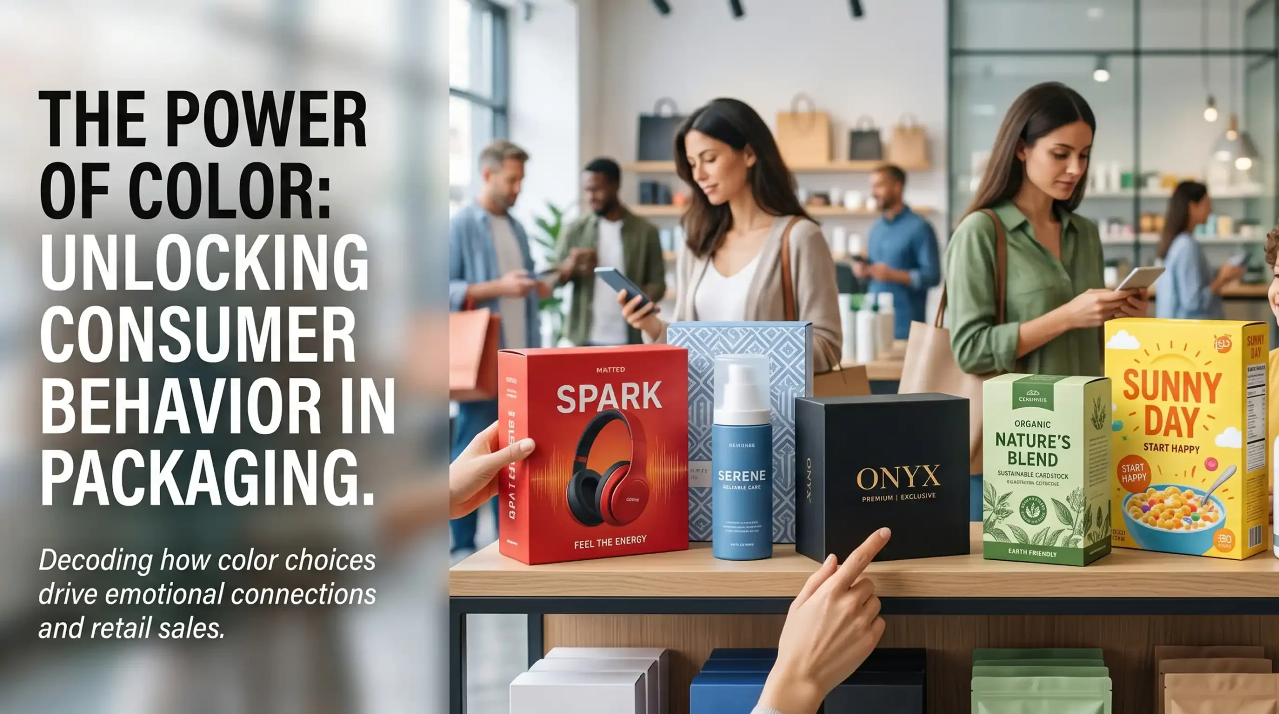
What This Exercise Told Me
The brands whose packaging worked shared one thing: they had thought about what their packaging should communicate, and then designed to communicate it. The brands whose packaging didn’t work had made packaging decisions without connecting them to brand strategy.
Your packaging is telling your customers something right now. The question is whether it’s telling them the right thing.
At Packaging Island we help brands figure out what their packaging should be saying and build the version that says it. packagingisland.com