 Skip to content


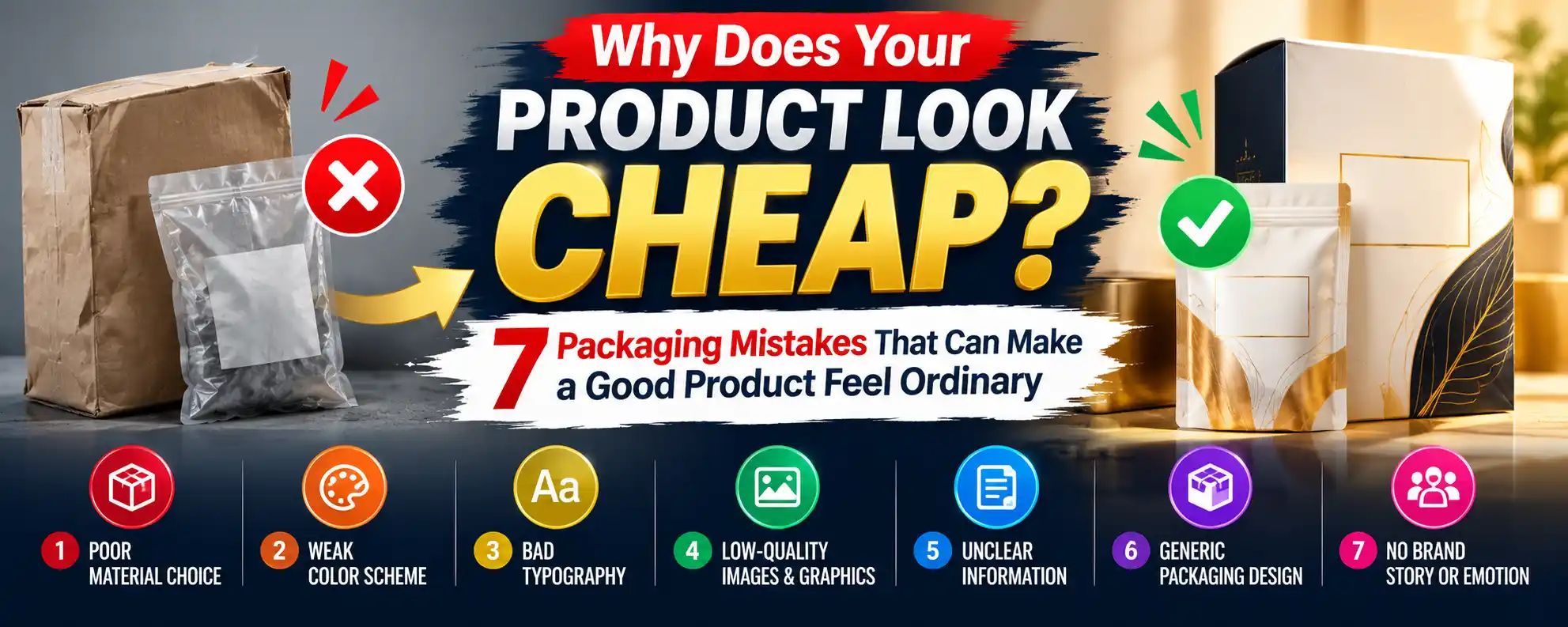



Why Does Your Product Look Cheap? 7 Packaging Mistakes That Can Make a Good Product Feel Ordinary
Your product might be excellent. The formula works, the stitching is clean, the flavor is right. But a customer meets your packaging before they meet any of that, and they judge it in a couple of seconds.
If your product feels “ordinary” on a shelf, in a photo, or in someone’s hands, the cause is rarely the product. It’s usually one of a handful of fixable packaging mistakes. After 6+ years of designing custom packaging and preparing print-ready files, I see the same seven problems repeatedly.
Key Takeaways
- Customers use packaging as a shortcut to judge quality, so weak packaging can lower perceived value even when the product is great.
- The most common causes are thin materials, wrong sizing, cluttered design, poor print files, missing finishes, inconsistent branding, and a forgotten unboxing experience.
- Most fixes cost little. Files, fit, and hierarchy cost nothing to correct. Material and finish upgrades often add only cents per unit at volume.
- Fix in this order: fit, print files, design hierarchy, material, then finish.
1. Using Flimsy Material That Feels Cheap in the Hand
Touch is the first thing a customer notices and the last thing they consciously think about. A box that flexes, dents, or crinkles when picked up says “low value” before they read a word.
Common signs:
- Thin paperboard on a product that is heavy or premium-priced
- Corrugated with visible warping or weak flutes
- Bags or mailers that wrinkle and tear easily
The fix: Match the stock to the product’s price and weight. A skincare set, candle, or apparel item usually needs a sturdier board than a lightweight accessory. Ask your supplier for a physical sample and squeeze it, drop it, and stack a few. If the sample feels average, the customer’s box will too.
2. Getting the Size and Fit Wrong
An oversized box with a product rattling around inside looks careless. A box that is too tight bends corners and scuffs the product. Either way, the customer reads it as “they didn’t think this through.”
Common signs:
- Large empty space around the product
- Product slides or rattles when shaken
- Excess void fill just to hide the gap
The fix: Build the box around the product, not the other way around. Measure the product at its widest points, add only the clearance the material thickness requires, and confirm inside dimensions (not outside) on the dieline. A snug fit also lowers shipping costs and damage claims.
3. Cluttering the Design With No Visual Hierarchy
Cheap-looking packaging is often over-designed. Four fonts, six colors, a logo in three places, and every claim shouted at once leaves the eye nowhere to land.
Premium packaging usually does the opposite. It makes one decision loudly and everything else quietly.
The fix:
- Choose one primary element: the logo, the product name, or one strong graphic
- Limit yourself to two typefaces and a tight color palette
- Give the design breathing room, because white space signals confidence
- Push secondary details (ingredients, claims, certifications) to a smaller, consistent zone
If someone can’t tell what your brand is from three feet away, simplify.
4. Sending Poor Print Files
This is the mistake that ruins good designs quietly. The concept is fine, but the printed result looks muddy, pixelated, or off-color.
Common file problems:
- Low-resolution artwork: logos and images stretched beyond their resolution print soft and blurry
- RGB instead of CMYK: bright screen colors shift and dull when converted for print
- No bleed or safe margin: white slivers appear at trimmed edges, and text sits too close to folds
- Live text not outlined: fonts substitute or shift at the printer
- Wrong dieline or scale: artwork doesn’t line up with folds and panels
The fix: Work from the exact dieline, build in CMYK with proper bleed, keep text inside the safe zone, outline fonts, and use vector logos. Always approve a proof before the full run. A physical proof is worth the wait for a large order.
5. Skipping (or Overdoing) Finishes
Finishes are where a plain printed box becomes something that feels considered. Without any, a design can look flat. With too many, it can look busy and costly in the wrong way.
What each finish does:
- Matte lamination: a calm, modern, understated feel
- Gloss: vivid and eye-catching, but shows fingerprints
- Soft-touch: a velvety surface that feels premium in the hand
- Spot UV: shiny highlights on a logo or pattern for contrast against a matte base
- Foil stamping: metallic accents that signal luxury when used sparingly
- Embossing and debossing: raised or pressed detail you feel as much as see
The fix: Pick one or two finishes that serve the design. A matte box with a single spot UV logo often looks more expensive than a box covered in effects. Finish choice should follow your brand personality and price point.
6. Treating Each Piece of Packaging as a Separate Item
A branded box with a generic shipping bag, a mismatched label, and plain tissue feels assembled from leftovers. Customers notice inconsistency even when they can’t name it.
The fix: Think in a system, not a single box.
- Use the same logo placement, color palette, and typography across boxes, labels, inserts, and mailers
- Keep tone consistent, so if the box is minimalist, don’t add a loud sticker
- Standardize small touchpoints like stickers, tape, and thank-you cards
A simple, repeatable system beats an expensive one-off design.
7. Forgetting the Inside and the Unboxing Moment
Many brands spend everything on the outside and leave the inside blank. Opening a box is the most emotionally engaged moment a customer has with your brand, and a bare interior wastes it.
Common signs:
- Plain, unprinted interior
- Product loose or held by mismatched filler
- No insert, no message, nothing to reward opening the box
The fix:
- Add a custom insert or tray so the product is presented, not just packed
- Print inside the lid with a short message or pattern
- Use branded tissue or a simple thank-you card
- Make the first thing the customer sees when opening the box intentional
The inside doesn’t need to be elaborate. It needs to look decided.
Quick Diagnostic: Does Your Packaging Pass?
Hold your packaging and answer honestly:
- Does it feel as valuable as your product’s price?
- Does the product fit snugly without rattling?
- Can you tell what the brand is in three seconds?
- Are the colors and edges printed cleanly?
- Does it have a deliberate finish?
- Do the box, label, and mailer look like one family?
- Is the inside intentional?
Any “no” points to the mistake to fix first.
Frequently Asked Questions
Does better packaging really increase sales?
Packaging shapes first impressions, perceived value, and shareability, all of which influence purchase and repeat orders. [ADD VERIFIED STATISTIC + SOURCE: e.g., consumer survey on packaging and purchase decisions, retrieved YYYY-MM-DD]. It won’t rescue a weak product, but it stops a good product from being undersold.
How much more does premium packaging cost?
Less than most people expect at volume. Material weight, finish, and inserts each add a small per-unit cost, and fixing file and fit issues costs nothing. A small upgrade is often cheaper than a reprint caused by a bad file.
What’s the single most important thing to fix first?
Fit and print files. A right-sized box printed cleanly beats an expensive box that rattles and prints muddy.
Can small brands make packaging look premium on a small budget?
Yes. Restrained design, a tight color palette, one good finish, and a consistent system do more than expensive materials. Low minimum quantities and stock sizes with custom printing keep costs manageable.
Should I get a sample before ordering?
Always. A physical sample or proof shows how the material feels and how colors print. That is much cheaper than discovering a problem after the full run.
Conclusion
A product doesn’t need to be expensive to look premium, and a great product shouldn’t look ordinary. Fix the fit, clean up the files, simplify the design, choose material and finish deliberately, keep everything consistent, and care about the inside.
If you’re not sure which mistake is hurting your packaging, send me your current box or artwork and I’ll tell you what to fix first.
